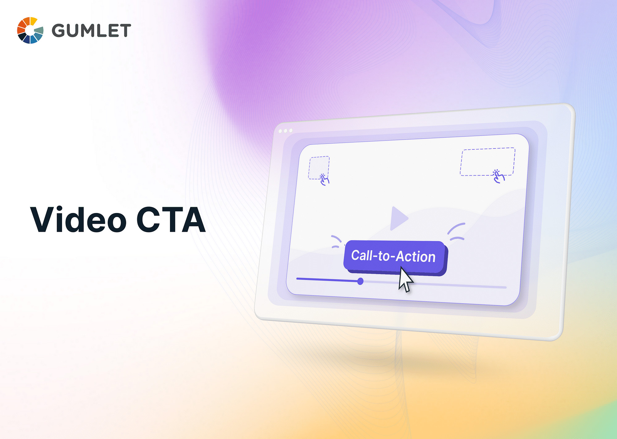
Video marketing is becoming increasingly popular, and the Call to Action (CTA) has evolved into a key part of this strategy. This article will guide you through mastering the art of creating effective Video CTAs and enhancing the impact of your video content.
What is a Video Call to Action?
A Video Call to Action, or CTA, is an explicit prompt within the video content encouraging viewers to take a particular action. This could be anything from signing up for a newsletter, purchasing a product, visiting a website, sharing a video, or any other action beneficial to the brand or company.
Schedule a Demo with Our Video Expert!
Discover how Gumlet can help you build a cutting-edge video streaming infrastructure.
Importance of CTAs for Video Content
The main goal of a video CTA is to drive engagement and conversion. By providing a clear direction, it helps convert passive viewers into active participants or customers. It essentially bridges the gap between content consumption and user action.
Types of CTAs
Call to Action (CTA) is not a one-size-fits-all tool. Different types serve different purposes, and their effectiveness can vary based on the content, the target audience, and the overall goal. Here's a deeper look at the various types of CTAs:
Direct CTAs
Example: "Buy Now", "Download Today", "Sign Up Now"
Usage: Direct CTAs are ideal for situations when you want your viewer to perform a specific action immediately after watching the video. These are often used at the end of product demos, sales pitches, or other promotional content.
Tip: Make sure the action you're prompting is straightforward and relevant to the content of your video. If viewers don't see the connection, they're less likely to follow through.
Informational CTAs
Example: "Learn More", "Read Our Blog", "Download Our E-book"
Usage: Use informational CTAs when you want to provide the audience with additional information or resources related to your video content. This can help establish your brand as a reliable source of knowledge and build a stronger relationship with your audience.
Tip: Ensure that the resources you're guiding viewers toward are truly valuable and relevant. Misleading CTAs can harm your brand's reputation.
Social CTAs
Example: "Like", "Share", "Follow Us"
Usage: Social CTAs are useful when the primary goal is to increase social engagement. They're often used in content designed to be shared widely, such as viral videos or content promoting social causes.
Tip: When using social CTAs, consider your audience's preferred social platforms. A "Share on Facebook" CTA may not be as effective for an audience that primarily uses Instagram.
Lead Generation CTAs
Example: "Subscribe", "Register Now", "Get a Free Quote"
Usage: Lead generation CTAs are perfect when your goal is to gather contact information from potential customers. This can be for newsletter subscriptions, webinar registrations, or free quote requests.
Tip: The viewers are giving you something valuable - their contact info. Make sure to offer them something valuable in return, such as useful content, special discounts, or exclusive access.
Sales CTAs
Example: "Add to Cart", "Purchase Now", "Start Your Free Trial"
Usage: Sales CTAs are used when the primary objective is to drive sales. They're often found in product descriptions, demos, or advertisements where the viewer has shown interest in a product or service.
Tip: Sales CTAs should make the purchasing process as easy and seamless as possible. They should take viewers directly to the checkout process or the sales page.
By understanding these types of CTAs and their best uses, you can optimize your video content strategy to encourage viewer engagement and achieve your marketing objectives.
Best Practices for Crafting Compelling Video CTAs
Creating an effective Video CTA involves:
- Understanding your audience.
- Crafting a clear and concise message.
- Introducing the CTA at the right time.
- Creating a sense of urgency.
- Constantly testing and improving.
Knowing your Target Audience
Understanding your audience is key to crafting a compelling CTA. By knowing their preferences and communication styles, you can tailor your CTA's language and visuals to appeal directly to them.
Example: Suppose your target audience is millennial coffee enthusiasts. A CTA like "Join the Coffee Connoisseur Club Today!" could resonate well with them, as it speaks directly to their interest.
Tip: Conduct audience research to understand your viewers' demographics, interests, and online behavior. Use this data to craft a CTA that aligns with their preferences and needs.
Clear and Concise CTA
The message of your CTA should be clear, concise, and action-oriented. The viewer should instantly understand what action they need to take.
Example: If you are launching a new product, a clear and concise CTA might be "Buy Now and Get 20% Off!".
Tip: Your CTA should be short and direct. Viewers should understand the action to take without any ambiguity. Keep it under five to seven words, if possible.
Timely CTA Introduction
CTAs can be introduced at any point in a video, but it's important to consider the content flow and viewer engagement for optimal timing. Some videos may benefit from a CTA at the start, while others may place it at the end or even multiple times throughout.
Example: If you're producing a how-to video, introduce a CTA to "Subscribe for More Tips" at the end of the video when viewers have seen the value of your content.
Tip: Analyze viewer engagement and drop-off rates at different points in your video to determine the most effective time to introduce your CTA.
Creating a Sense of Urgency
Creating a sense of urgency can encourage immediate action. This could involve time-limited offers or promotions, instigating viewers to act quickly.
Example: If you're running a limited-time sale, your CTA might be "Shop Now! Sale Ends in 24 Hours".
Tip: Incorporate phrases like "limited time", "hurry", and "before it's gone" to create a sense of urgency. This motivates viewers to act promptly rather than procrastinate.
Crafting Compelling CTA Copy and Design
Your CTA should not only sound appealing but also look attractive. Powerful verbs, action-oriented language, and visually compelling designs can make your CTA stand out and catch the viewer's attention.
Example: For a charity video, a CTA saying "Change a Life Today. Donate Now!" accompanied by an eye-catching, heart-shaped button can be very effective.
Tip: Choose powerful, action-oriented words and a visually appealing design for your CTA. A/B testing can be particularly useful to determine which designs and phrases resonate most with your audience.
Implementing Interactive CTAs
Adding interactive elements, such as clickable buttons or overlays, can increase engagement and make it easier for viewers to take the desired action.
Example: For an online course, you might incorporate an interactive CTA such as "Click Here to Start Your Free Trial" within the video.
Tip: Use clickable buttons, forms, or overlays within the video to make it easier for viewers to take action without leaving the video.
Optimizing CTAs for Mobile
Given the growing number of people consuming video content on mobile, it's crucial to optimize your CTAs for these devices. This involves ensuring click-ability, mobile-responsive landing pages, and easy-to-read text.
Example: If your video is a trailer for a new mobile app, your CTA could be "Download Now on the App Store", designed to be easily clickable on a mobile screen.
Tip: Make sure your CTA is easily readable and clickable on small screens. A mobile-responsive landing page should be ready for viewers who click through from mobile devices.
Measuring and Analyzing Video CTA Performance
Analyzing your CTA's performance helps understand its effectiveness and identify areas of improvement. There are several tools available, such as Google Analytics, to track metrics like click-through rates, conversion rates, and viewer engagement.
Example: After introducing your CTA, monitor metrics such as click-through rates and conversions. If your "Sign Up for More Info" CTA isn't generating many sign-ups, you may need to revise it.
Tip: Use analytics tools like Google Analytics to measure and understand your CTA performance. Keep a close eye on metrics that align with your CTA's goal, and be ready to make changes based on your findings.
A/B Testing and Iterating
By conducting A/B tests, you can compare different variations of CTAs in terms of color, placement, wording, and more. Once you analyze the performance metrics, you can identify the best-performing CTA elements.
Example: You could create two versions of a product video, each with a different CTA design or copy, and monitor which version gets more clicks or conversions.
Tip: Use A/B testing tools to compare different CTA variations and identify which performs best. Always be iterating and improving based on data from your tests.
Using these insights, you can continually refine and iterate on your CTAs to improve their effectiveness.
Conclusion
Mastering the art of effective Video CTAs is a crucial skill in today's digital marketing landscape. By understanding the various types of CTAs and the best practices for crafting compelling ones, you can greatly enhance the impact of your video content and boost viewer engagement and conversions.
FAQs
Q: What are CTA elements for video?
A: CTA elements for video include:
- The prompt or action language ("Buy Now", "Subscribe").
- The visual design (color, size, typography).
- The placement within the video (beginning, middle, end).
- Any interactive elements (clickable buttons, forms).
Q: How do you add CTA to YouTube videos?
A: To add a CTA to YouTube videos, you can use YouTube's in-built features like end screens and cards, which can include clickable buttons linking to a website, another video or a playlist, a channel, or a call to donate. You can also include CTAs in your video description or within the content.
Q: What are some common mistakes to avoid when creating a video CTA?
A: Some common mistakes to avoid when creating a video CTA include using vague or generic language, making the CTA too long or confusing, placing it in an obscure position, or failing to align the CTA with the overall aim or message of the video.
Q: How long should my CTA be displayed on the screen?
A: It's generally recommended to display your CTA long enough for viewers to read and comprehend it, usually a few seconds. Also, it's often beneficial to verbally mention the CTA while it's displayed.


